SQL Server 2017: New Security in Analysis Services Tabular 1400

With SQL Server 2017 going GA this week, there’s been a lot of talk last week and this about new and improved features; this post is no different, but, I’m going a slightly different direction.

SQL Server Analysis Services Tabular models were first introduced with SQL Server 2012 (suddenly that seems so long ago) and have undergone continual and sometimes rapid revisions ever since. This remains true with SQL Server 2017, with the introduction of decent list of new features and other improvements.

One of the most exciting for me is the introduction of built-in support for object-level security.

But, We’ve Had Roles and Row Filters the Whole Time!

We have; you’re right. But, one thing that Tabular has never had–or Multidimensional models, either–is a built-in, easy way to do security in the other direction–columns!

Row level security is a very robust feature, and remains great. However, if there are situations where some columns or tables in the model shouldn’t be visible by all users (think Personally Identifiable Information), there wasn’t really a way to handle this before. Hoops would have to be jumped through utilizing DAX and possibly utilizing two different copies/versions of the same table in order to implement this behavior. Sometimes there would even need to be different versions of the same reports, based on which user group they were intended to target (with the underlying security/configuration of the cube driving what the user could or couldn’t see). This was, generally, a pain.

Perspectives are/were never intended as a security feature, and that hasn’t effectively changed with this.

In order to utilize this new feature (and the others), your tabular models will need to be developed/deployed in the 1400 compatibility level. This can be set when creating new models, in addition to being able to upgrade existing models (but this is a one-way street).

Azure Analysis Services

Since AAS is still my favorite thing, I can’t talk about SSAS without plugging it a little bit. Although 1400 compatibility has only been available in the on-prem product for about 24 hours now, it has been available in Preview in AAS since May. This is indicative of Microsoft’s cloud-first strategy–features will be available here first, filtering down to the on-premises software “later.” This may not be for everyone, but I think it’s one of the great reasons to consider Azure’s Platform as a Service offerings (another one is the built-in high availability).

Using Excel and Get Data to Find Fixes in SQL Server CUs

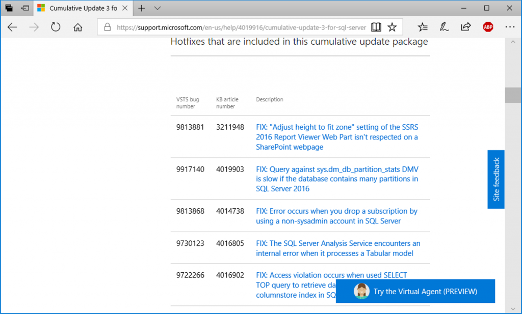
Lately, for whatever reason, we’ve had clients running into a small rash of bugs or bug-like behavior in SQL Server; soGetData Buttonsme in the Engine, some in SSRS (the SSRS ones have been fun). In one case, it occurred a day or two after SQL Server 2016 SP1 CU3 was released, so we (I was talking to Joey about it at the time) had a list of fixes to go through.


This is fine and all, but when one is looking for a fix for a specific behavior (“I’ve had this bug all summer, so I want to look through every CU release to see if it’s in there”), it’s a bit of a pain to go through the whole list just scanning for the, say, Reporting Services fixes. It’s even worse if the instance is behind and you need to look through multiple CUs for something. Another scenario is if you are just reviewing a newly-released CU and really only care about fixes that pertain to the engine…you get the idea.

These lists can get long

Business Intelligence to the Rescue!

Fortunately, there are some tools built right into Excel that make this a whole lot easier than scrolling through the list in your browser. Armed with nothing more than the URL to the CU’s KB article and Excel 2016 (or a few older versions) quick work can be made of generating custom filters for this data.

Here are the steps:

In Excel 2016, click on the Data tab of the ribbon. This is where the artist formerly known as “Power Query” lives, now referred to as “Get & Transform.”

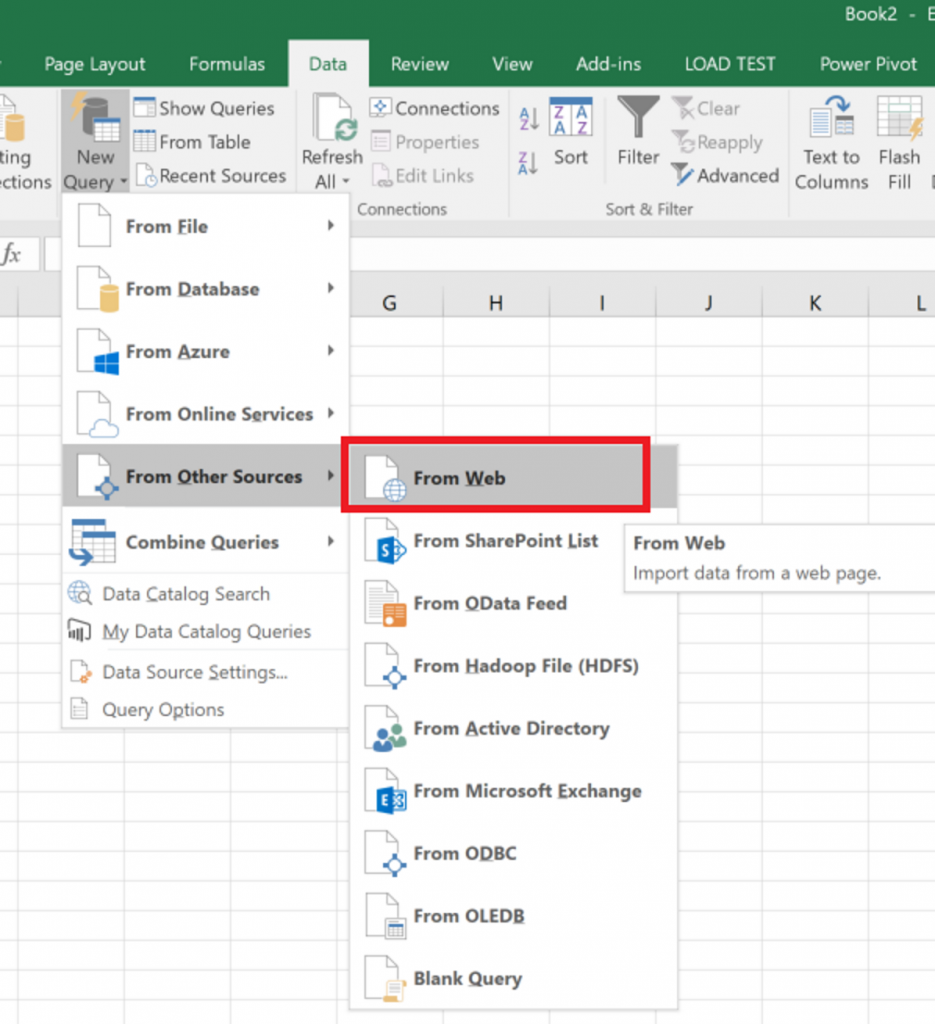
Starting with the New Query button, navigate down through the menu to From Other Sources and then From Web:

New Query | From Other Source | From Web


This brings up a simple little dialog that asks for a URL. Paste in the URL for the CU page you’re interested in; here, I’m using SQL 2016 SP1 CU3’s URL: https://support.microsoft.com/en-us/help/4019916/cumulative-update-3-for-sql-server-2016-sp1

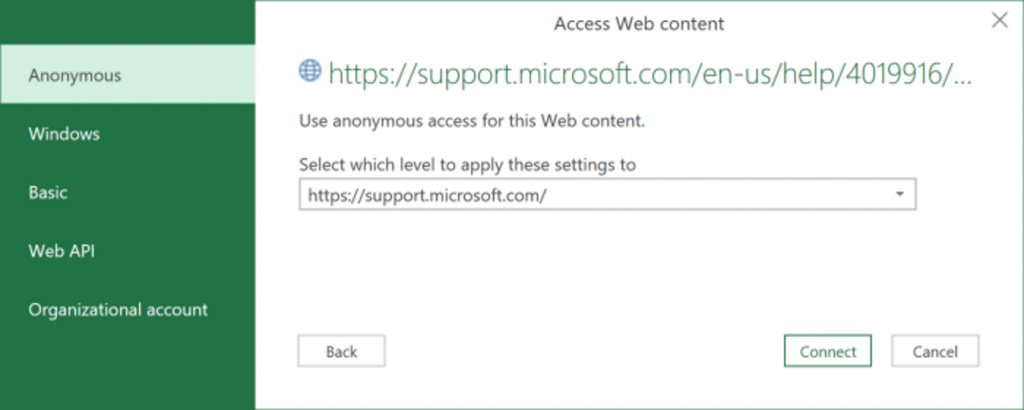
Clicking OK brings up the next dialog, a security-related dialog that allows you to provide any credentials that may be needed to access the material. Of course, in this case, no specific credentials are needed, as it is a public web page. Leaving Anonymous selected here is the way to go.

Web Page Security

Clicking Connect will bring up the real meat of Power Query Get Data, where we will choose what data we want to import, and optionally do some ETL-like transformations to it.

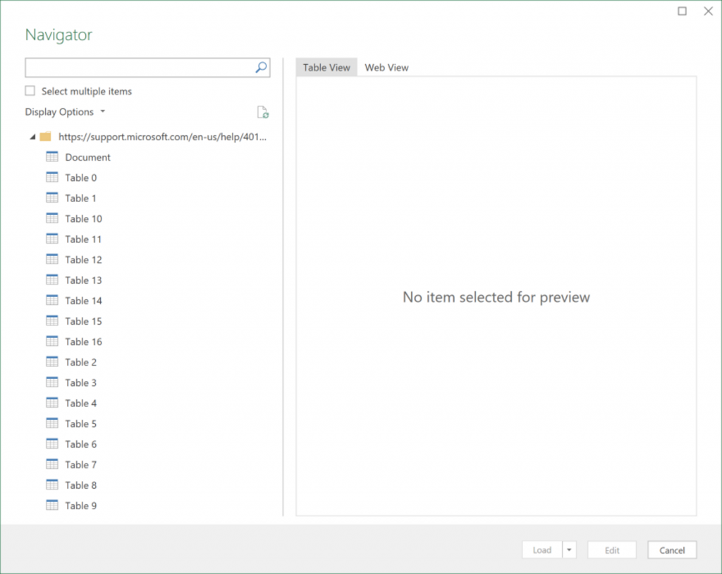
Whenever pulling in data from a web page/table for the first time, there is a bit of experimentation that needs to happen. For example, when the “Navigator” dialog opens for the first time, there’s a big list of Tables from the web page, and no data displayed:

Select Table to load data from

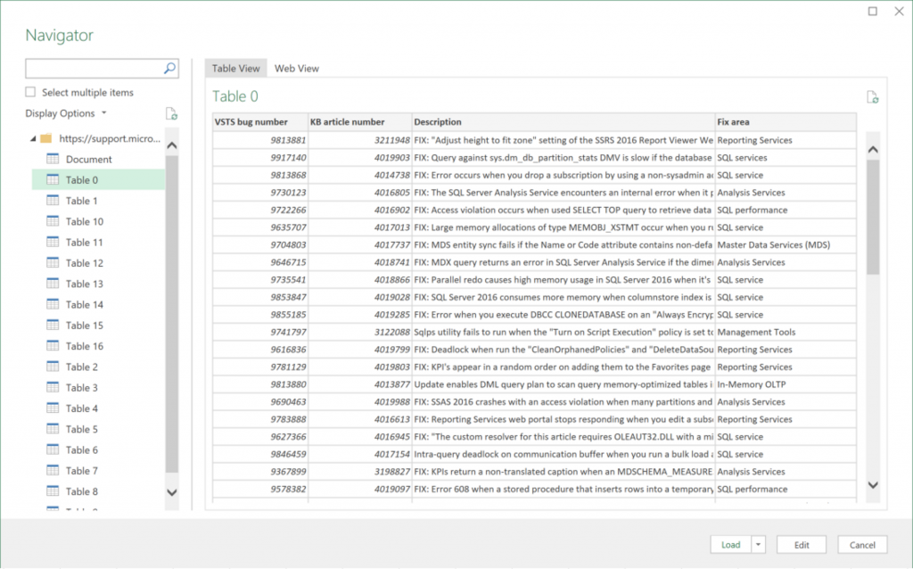
What has to happen, is you need to find which of those tables contains the data on the web page you’re interested in. In our case, we’re interested in Table 0, where we can see the data we’re looking for; mainly the Fix area column:

Populated Table 0

Quick note: The reason for so many tables of other data on this page is that down towards the bottom of the page, under the “Cumulative update package file information” link/collapsed menu are a bunch of tables that contain a bunch of information about all of the files that are modified by fixes in this CU. All of those tables are available here, too.

Once the table you’re interested in is selected, we can move on. The next step could be clicking the Edit button, where you’d be able to do all kinds of transformations to the data in this table… here, we don’t need to do that, so can skip that part and go straight to loading the data.

As we’re only looking to read through this data on its own (as opposed to loading it into a Power Pivot data model), we can just click the Load button.

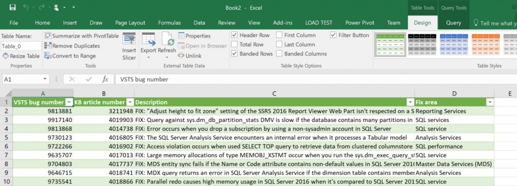
The end result will be a table of data in Excel that contains all the fixes in the CU:

Populated Fixes in Excel table

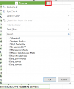
The best part about this, and the whole reason we’re here, is Excel’s “Auto Filter” feature works on this table (and it is already activated, even). Clicking on the arrowhead in the “Fix area” column yields this familiar pop-up menu, where all manner of sorting and filtering can be done.

Excel Auto Filter dialog

Simply check the area of the product you’re interested in from the list, and you’ll be presented with a nice short list of fixes to look through.

Fix list filtered to Heckaton

Awesome!

Re-use

But, let’s say you’ve gone through this, and you’re thinking “that was kind of a pain, and won’t really save any time for all the more often that page needs looked at.” That’s possibly a fair assessment. Since all of these CU pages are identical (for now), the extract logic stays the same, with the only thing needing to change being the source URL. Once you’ve set up this workbook once, you can save the file and modify the URL it pulls its data from when the next CU comes out, but the amount of clicking required to do that is about the same as it takes to set this up the first time, therefore I’m not sure how helpful that would be.

Probably the best thing to do is to save this file off after you’ve created it and reference it as-needed, clicking the Refresh All button on the Data tab when you open this to make sure you have current data.

T-SQL Tuesday #22: Data Presentation

TSQL Tuesday Logo

Robert Pearl hosts No.22

It seems like it hasn’t been that long since last month’s T-SQL Tuesday post; I suppose time flies when you’re having fun and trying to finish up the same ETL project you’ve been working on since March.

This month’s SQL blog party is being hosted by Robert Pearl (blog| @PearlKnows), on the topic of “Data Presentation.” This is a good topic for me at this point, as I’ve all but finished my transition from DBA to BI Monkey (that’s something else I need to write about…). I think Robert is looking for specific examples of ways to present data, but since, as usual, I don’t have anything specific that I can actually publish, I’m left to speak generally about the topic.

Data Presentation: Just as Important as the Data Itself

In a previous life, I was responsible for almost everything data-related for the systems that we ran. As a result, I would get a lot of requests for data. One of my favorite requests would come in the form of, “can you give me some numbers for <X system>?” I would try to keep my response at least marginally non-snarky, but it would generally include two questions:

  1. What, exact, “numbers” do you want? (this is especially where I would have snark problems)
  2. What do you want the data to look like?

Of course, the first one is an important question—if the requestor cannot articulate what it is they actually want (or even what question they’re trying to answer), little else is going to matter. I’ll not dwell on this particular item too much, but suffice to say, sometimes getting a good answer to this seemingly easy question is anything but. I’ve basically come to the conclusion that this is normal.

Once over that hurdle, the conversation can move on to the presentation of whatever data/”numbers” it is the requestor wants. There are almost as many options for presenting data as there are for way to write the T-SQL to retrieve it. Just like writing the SQL in a way that is performance- and resource-conscious, care should be taken when working on the presentation design. It is imperative for the data to be presented in such a way that is understandable and digestible by its intended audience.

Notice I didn’t say “digestible by the party asking for it.” Don’t forget that the request originator may not be the party who is ultimately going to be parsing the provided data. If the audience is not clear in the original request, add a third question to the two that I have listed above: “Who is going to be acting on this data?”

Options for What Happens Next

When the “What do you want it to look like” question is asked, chances are decent that you’ve an idea about what the answer is going to be. If this is a one-off, ad-hoc request, Excel is a popular option. Alternatively, if a robust reporting system is in place, or this request will be a recurring one, developing a report to present the data might be a stronger choice. There are of course other options: the data could be destined for a statistical analysis application, where a CSV file would be more suitable. I would consider this an outlier, though—most of the time, data is prepared for direct human consumption.

Excel is such a popular option that you could almost call it Data’s Universal Distribution Engine (DUDE). Sending data over in Excel is less about the “make it pretty” side of good presentation as it is the “make it useful” side. I’ve found that Excel is a choice a lot of the time because the requestor wants to do more manipulation of the data once they get it. I’ll leave whether or not that is a good thing to the side; the truth is, such activity happens all the time. As a result, when preparing data for an Excel sheet, I like to have an idea of what the user is going to do with it. This sometimes helps to determine what data the user is looking for (if they don’t have a clear idea) but also can help with some formatting or “extras” to include. These “extras” could take the form of running subtotals, percent changes for Year over Year situations, or anything else that is easier to add via SQL instead of someone having to putz around in Excel.

Writing a report to present data has a different set of opportunities than pasting data into Excel. One of the things that I like to see in a solid reporting environment is a set of standards that apply to the reports themselves. Things like common header contents (report name, date/time stamp, name of the data source/DB the data is from, etc), standard text formatting, a common set of descriptors, etc, etc. In addition to making individual reports easier to read & feel more familiar, it can make it easier to compare data etween reports the hard way (one on each monitor), if one has to.

It's only worth 1,000 words if the first ones that come to mind are work safe

One thing each of these two tools gives you is the ability to present data in the form of pretty pictures. There’s a time and a place for everything, but the old cliché, “a picture is worth a thousand words” can/does apply. Sometimes it’s just flat-out hard to beat a good trendline. I have a much easier time seeing even the simplest of trends when data’s plotted out in a histogram. Conversely, one of my coworkers can look at a pile of numbers, not even sorted chronologically, and tell you what is going on in about three seconds.

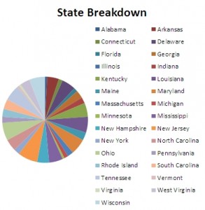
Knowing where to put your effort goes back to knowing who your intended audience is. Likewise, knowing when to say “no” to visualization is a terribly useful skill. Every data element on the chart should be discernable, or else it doesn’t convey the information it is supposed to, and now the visualization is working against itself. The pie chart to the right? Don’t do that.

Summary

That’s about all I’ve got. In short: Presentation is important. Unfortunately, it can also be complicated. It’s important to ask questions early on in the process and to know your audience. Standardize if you can; help out a little with the complicated work if it can be done in SQL. Also, add visual representations without going overboard. I’ve always found turning “data” into “information” for people to be fun; if it can make someone else’s job easier/more fun, too, then all for the better.