Monthly Archives: September 2011

Seattle in October

Next month, something awesome is going down.

PASS 2011

I haz a happy

For the first time since the Two Weeks in Junetrip in 2008, we’ll be going to conferences. For the first time in…well…ever, the conferences we’re going to are the same one at the same time.

Finally, FINALLY, we’re heading to Seattle for the Professional Association for SQL Server’sannual Summit. This conference was first put on my map when it basically replaced the MS BI conference in 2009 (which wound up getting scheduled for every two years). At the time, I was getting deep into my first “real” DBA job, taking the somewhat long and temporarily divergent road towards a career in BI. I came very close to footing the bill myself for the conference that year, and it would have been pretty interesting to see what would have happened since then had I made that move…

Anyway, we’re both going for real this year, and I’m looking forward to just about everything about it. I can’t wait to meet everyone from the SQL Server community that I haven’t yet (which is most everyone), to possibly sing badly (#SQLKaraoke), to try to split myself up into three pieces to go to all of the sessions that I want to go to (although I haven’t run through the schedule yet), and to try to find time to mumble onto the keyboard to get some posts up here about whatever is going on.

There are a couple things different about this one, though. I won’t be attending a precon session for the first time. That’s a little weird for me, as I think of it as part of the conference experience, and I always get a lot of good info out of them. When I’ve gone to conferences before, I haven’t had great reasons to go to BI-related sessions; I’d just check them out because I’d have the time and/or because I was interested in that sort of stuff. This time, pretty much the primary reason I’m attending is to go to every SSAS session I can. This is really awesome for me.

The other big thing that will be different is my attendance in after-hours events. For the TechEds & Connections conferences I went to, I went to very few after-hours events, either official or unofficial. We’re going to be hitting as much as we can this time, spending time with as many of our fellow Data Nerds™ as possible. Hopefully we won’t annoy too many people—we wouldn’t want to get blacklisted or anything 😉

So, in about a week and a half (!), we will get to spend some quality time in the back of a Southwest Boeing, KBNA—>KSEA. This trip will put me both the furthest West & North I’ve ever been (I don’t get out much), and that will be neat, too. We’ll be missing the photowalk on Monday, which is a bummer, but will be in town through the following Monday, so we’ll have plenty of time to spend with the Emerald City.

I know it’s getting close, but there’s technically still time! If you’re a SQL Server Pro, any of DBA, BI Monkey, or Dev, if at all possible, you should be here for this. I don’t explicitly know what we’re all getting into, but from what I’ve heard and read, there is no better place to be.

Did I mention that I’m excited about this? Yeah, I’m excited about this. The lack of sleep that’s going to happen that week, though? Yeah, I like my sleep. A lot. I’m not sure how that’s going to go.

T-SQL Tuesday #22: Data Presentation

TSQL Tuesday Logo

Robert Pearl hosts No.22

It seems like it hasn’t been that long since last month’s T-SQL Tuesday post; I suppose time flies when you’re having fun and trying to finish up the same ETL project you’ve been working on since March.

This month’s SQL blog party is being hosted by Robert Pearl (blog| @PearlKnows), on the topic of “Data Presentation.” This is a good topic for me at this point, as I’ve all but finished my transition from DBA to BI Monkey (that’s something else I need to write about…). I think Robert is looking for specific examples of ways to present data, but since, as usual, I don’t have anything specific that I can actually publish, I’m left to speak generally about the topic.

Data Presentation: Just as Important as the Data Itself

In a previous life, I was responsible for almost everything data-related for the systems that we ran. As a result, I would get a lot of requests for data. One of my favorite requests would come in the form of, “can you give me some numbers for <X system>?” I would try to keep my response at least marginally non-snarky, but it would generally include two questions:

  1. What, exact, “numbers” do you want? (this is especially where I would have snark problems)
  2. What do you want the data to look like?

Of course, the first one is an important question—if the requestor cannot articulate what it is they actually want (or even what question they’re trying to answer), little else is going to matter. I’ll not dwell on this particular item too much, but suffice to say, sometimes getting a good answer to this seemingly easy question is anything but. I’ve basically come to the conclusion that this is normal.

Once over that hurdle, the conversation can move on to the presentation of whatever data/”numbers” it is the requestor wants. There are almost as many options for presenting data as there are for way to write the T-SQL to retrieve it. Just like writing the SQL in a way that is performance- and resource-conscious, care should be taken when working on the presentation design. It is imperative for the data to be presented in such a way that is understandable and digestible by its intended audience.

Notice I didn’t say “digestible by the party asking for it.” Don’t forget that the request originator may not be the party who is ultimately going to be parsing the provided data. If the audience is not clear in the original request, add a third question to the two that I have listed above: “Who is going to be acting on this data?”

Options for What Happens Next

When the “What do you want it to look like” question is asked, chances are decent that you’ve an idea about what the answer is going to be. If this is a one-off, ad-hoc request, Excel is a popular option. Alternatively, if a robust reporting system is in place, or this request will be a recurring one, developing a report to present the data might be a stronger choice. There are of course other options: the data could be destined for a statistical analysis application, where a CSV file would be more suitable. I would consider this an outlier, though—most of the time, data is prepared for direct human consumption.

Excel is such a popular option that you could almost call it Data’s Universal Distribution Engine (DUDE). Sending data over in Excel is less about the “make it pretty” side of good presentation as it is the “make it useful” side. I’ve found that Excel is a choice a lot of the time because the requestor wants to do more manipulation of the data once they get it. I’ll leave whether or not that is a good thing to the side; the truth is, such activity happens all the time. As a result, when preparing data for an Excel sheet, I like to have an idea of what the user is going to do with it. This sometimes helps to determine what data the user is looking for (if they don’t have a clear idea) but also can help with some formatting or “extras” to include. These “extras” could take the form of running subtotals, percent changes for Year over Year situations, or anything else that is easier to add via SQL instead of someone having to putz around in Excel.

Writing a report to present data has a different set of opportunities than pasting data into Excel. One of the things that I like to see in a solid reporting environment is a set of standards that apply to the reports themselves. Things like common header contents (report name, date/time stamp, name of the data source/DB the data is from, etc), standard text formatting, a common set of descriptors, etc, etc. In addition to making individual reports easier to read & feel more familiar, it can make it easier to compare data etween reports the hard way (one on each monitor), if one has to.

It's only worth 1,000 words if the first ones that come to mind are work safe

One thing each of these two tools gives you is the ability to present data in the form of pretty pictures. There’s a time and a place for everything, but the old cliché, “a picture is worth a thousand words” can/does apply. Sometimes it’s just flat-out hard to beat a good trendline. I have a much easier time seeing even the simplest of trends when data’s plotted out in a histogram. Conversely, one of my coworkers can look at a pile of numbers, not even sorted chronologically, and tell you what is going on in about three seconds.

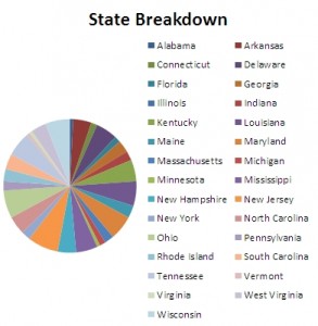
Knowing where to put your effort goes back to knowing who your intended audience is. Likewise, knowing when to say “no” to visualization is a terribly useful skill. Every data element on the chart should be discernable, or else it doesn’t convey the information it is supposed to, and now the visualization is working against itself. The pie chart to the right? Don’t do that.

Summary

That’s about all I’ve got. In short: Presentation is important. Unfortunately, it can also be complicated. It’s important to ask questions early on in the process and to know your audience. Standardize if you can; help out a little with the complicated work if it can be done in SQL. Also, add visual representations without going overboard. I’ve always found turning “data” into “information” for people to be fun; if it can make someone else’s job easier/more fun, too, then all for the better.