I know, all of my friends have been busy playing with the Gold bits of SQL 2012, and that’s all well and good. I should be doing that, too, really really. Except…Well… I don’t exactly need to worry about that at this point, unfortunately. Different story. Instead, I’m playing with the Beta Consumer Preview release of Windows 8, because I like Windows (news flash).
Back in college, I would use my laptop as the test-bed for new stuff. I carried it to classes, so I got a lot of keyboard time with it (and a lot of show & tell, too). New Office & Windows versions were the most-used victims, as I took notes in Word—these were the days before OneNote. After my freshman year, I had a desktop, too, so I always had a more stable place to get work done if I had problems with anything. I would have used my current laptop for this, but it’s an old boat anchor (a Latitude 120L), and has too old/crappy of a video card to run the display at its full res in 8. Tried it with Dev Preview & the best I could get was 800×600. I fiddled with the disk subsystem in my ESXi server & installed 8 directly on that hardware to test a couple of applications that I wanted to make sure worked before I got to…
Blowing Up the Main Desktop
It was a perfectly healthy, couple year old install of 7, but it was on a semi-decent machine (Presler core P4) with a good video card, so it had to die (you know, for science).
The usual first step of this process is copying the ISO contents to a USB stick for install. Since I don’t do this very often, I always have to look up the steps to make sure I don’t forget something while fumbling around in diskpart. For whatever reason, this time I stumbled upon a link to the Windows 7 USB/DVD Download Tool. This is a neat little thing that automates the task of transferring an ISO of Windows Install media to a bootable USB disk (don’t let the “Windwos 7” in the name fool you). I doubt it’s faster than XCOPY, but it’s a little easier.
The install itself went pretty quickly after a couple false starts. Can’t really compare it to anything, but it did seem fast. On its first boot, it offers to let you attach a/your Live account to it, like Windows phones do (and Google accounts on Android and AppleID on the iPhone). On my first test machine I went ahead and tied it to my Live account just to see what it did. The answer: other than grabbing your account’s picture and making it fairly ticklish to figure out how to auth when RDPing to the machine, I’m not really sure what it did. It may not be fair to say that since I spent a total of about 20 minutes on that install, but that’s how not-obvious it was.
On my “real” test install, I put the machine in our test domain, did my usual early system settings changes, & worked through the high points of my application install list. No real hiccups there, so I was able to get on with…
Actually Using the Thing
This all happened a month or so ago now, but I’ve still only gotten a fistfull of good usage hours with it. In that time, I’ve gotten a few things to talk about and/or show. None of these are really earth-shattering; just the things that stick out for me. For a more general overview of it, check out some of PeterB’s DrPizza’s Peter Bright’s articles related to the topic.
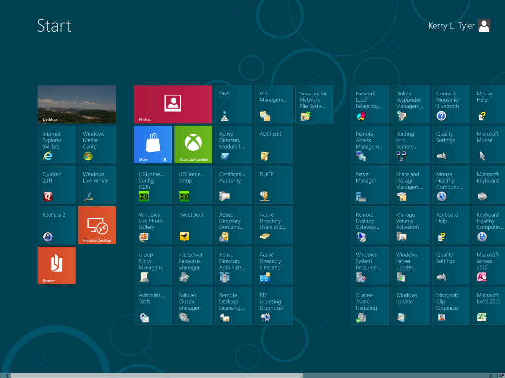
Obviously the biggest change and the elephant in the room is the introduction of the Metro UI to Desktop Windows. One of the side-effects of this is the Start Menu goes away. This is a pretty big shock, and it still catches me off-guard when I hit the Windows Key and the main monitor (I’ve got two on this machine) flips over to the Start Screen. Gone is the ability to organize things via folders. Instead, if an app wants to put shortcuts on the Start Menu, they just wind up on the Start Screen. They get arranged into blocks of icons by default, and you can arrange/delete them further if you like. Near as I can tell, that is the extent of the organization options one has. The problem that I found is if you install something like Server Admin Tools (there’s already a pre-release version for Windows 8, which is fantastic) that adds a lot of shortcuts all at once: the default behavior is apparently for these icons to simply be barfed all over the Start Screen.
I don’t think this is a good thing, but in this architecture, I’m not sure what else can be done. If one’s interested in keeping the Start Screen tidy, there’s going to be a lot of micromanagement to do. On the other hand, back in Vista, a search bar was added to the bottom of the Start Menu. Handily, that text box had focus when the Start Menu was raised, so one could mash Flag (“Flag” is how I usually refer to the “Windows Logo Key”, primarily because “Windows Logo Key” is way too damn many syllables) and start typing to bring up whatever shortcut they’re going for. Judging by commentary I’ve read about that particular feature (OK, it’s mostly Ars readers), it seems a decent chunk of people use that as their primary app starting/finding vector for things that aren’t pinned to the Taskbar. In Windows 8, even though there isn’t a visual cue for it, this functionality is still there. Hit Flag, and start typing. A search screen will come up showing results for Applications, Settings (Control Panel Applets), and Documents; these are all the same categories of things that the Search bar in the old Start Menu will return. Not being one who uses this search to find things very often, I’m going to need to get used to it if I don’t want to spend more time than I do now managing what the Start Screen looks like.
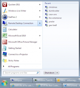
One thing I can say for certain: I’m going to miss is the “recent” list that shows up for some applications in the old Start Menu. This is the list of docs that will cascade out from the app’s shortcut when an app is pinned or otherwise lands on the main part of the Start Menu. I admit that I don’t use this feature all that often, but there are a few things, Remote Desktop being one, where I use the recent list almost exclusively when calling the application. It does work the best when a small set of files are used all the time (like, say, shortcuts to the ETL servers), but it’s really useful for that sort of thing. I haven’t found a way to mirror this functionality in 8, and that’s a bummer.
Once over the initial hurdle of getting past the Start Screen (hint: click on the “Desktop” button), in what I would consider normal use, I don’t feel like I’m using anything other than Windows 7 (or Vista, for that matter). My normal usage pattern on this machine resembles what most people would consider “work”—Office apps, web browsing/research, Quicken, Twitter (old TweetDeck!), and Live Writer for blogging. I would say photo editing/management, but that barely gets done anymore. Non-“work” stuff involves Windows Media Center, and not much else; don’t have time for gaming anymore, either. All of these things are non-Metro (“classic”) Desktop apps, and as such, operate on the desktop. Using this kind of application and launching them either using pinned Taskbar icons or opening documents straight from the file system means that I hardly ever see any Metro UI elements.
That’s pretty much a good thing, until a bunch of time goes by and one forgets what they’re doing. Then, for example, a random app is needed from the Start Menu. Hit Flag, and get smacked in the face by the full-screen Metro Start Screen. This has happened to me more than a few times since I’ve been using 8. I also haven’t put Acrobat Reader on the machine yet, so when I open a PDF, the built-in reader app launches, which is a Metro app. Smacked in the face again. This one is of course my own fault, as I’ve delayed putting Acrobat on to at least try the built-in reader for a while to see what I think about it. It’s very jarring when this happens. It’s also disruptive at the moment, because it’s so different and still new.
Speaking of these full-screen Metro apps, they have two major drawbacks to me. One is the fact that they’re full-screen. On a machine with a nice high resolution, I hardly ever maximize windows/applications to use them, so this is a little annoying. There is the fixed two-app display thing available, but it’s still a little wonky when it involves one Metro app and the Desktop. Since the Desktop behaves as a single application in this situation, if it’s the app on the small side of the split-screen, then the windows running on the Desktop become the same little thumbnails that pop up when you mouseover window buttons on the Taskbar. As a result, it’s likely that you can’t read what’s going on and you definitely can’t interact with them. This arrangement isn’t overly useful.
The second major drawback is something that got in my way early on: The only arrangement choice with Metro apps is on the main monitor. What if I want to put that application on the smaller of the two monitors I have (which isn’t the main one)? Turns out, that can be done. Among the list of keyboard shortcuts outlined in this Windows Team Blog entry is Flag – PgUp/PgDn, which “Move[s] Start screen to Left/Right Monitor.” That command does exactly what it says it does, but also moves full-screen Metro apps with it (plus the “primary” Taskbar). It appears to be the same functionality as the “Use this monitor as my main monitor” checkbox on the Display Options dialog, just in handy keyboard shortcut form. The operation itself is smooth and fast, even on my less-than-optimal hardware, and technically it does address what I was trying to do. As part of moving the whole Metro…environment, for lack of a better term, it takes the built-in split-screen functionality with it. I guess that makes sense, but all of these “features” just continue to make the whole thing feel contrived.
While using this, a couple specific items stuck out at me, and I’ll go through those next.
File Copy Status
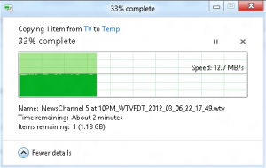
From the “it’s the details that count” category, we have the File Copy Status Dialog. (If this thing has an actual name, I obviously don’t know what it is.) Couple new things here which, as a completely crazy person who likes to watch numbers change, are welcome additions.
First, I almost always hit the “More Details” button to see what kind of throughput I’m getting on a copy/move/delete. Finally, in Windows 8, if you flip it to the More Details version of that little dialog, the setting sticks! Every time a file is copied, the status dialog opens with all of the details showing. Awesome.
Even better is a little throughput histogram which is now shown. This thing pulls triple duty, visually representing both percent complete and current/historical throughput, and also showing the current throughput in text form. Because at the moment I’m not overly enthused with this OS, this dialog is probably my favorite new feature.
New Task Manager
There’s a new Task Manager in 8. It brings some of the functionality of the full-blown Resource Monitor down into the smaller Task Manager package. I find this a bit of a mixed blessing, but in general it’s pretty nice. I usually leave Task Manager run all the time, so am a little worried about the performance impact with the new one—I’ve sometimes seen Resource Monitor peg out a CPU core while displaying disk activity.
That’s all well and good. BUT! With this machine, I got the old task manager! At first, I thought it was just because I decided to put it in the domain for this evaluation. Long story short, I had Task Manager pinned to the Taskbar on this profile, and I had used that shortcut to start it. Turns out, there are now two different Task Managers in Windows—the old one is still taskmgr.exe & the new one is TM.exe. The new one does eat a lot more RAM than the old, so there’s at least that going on between them. I’d guess that the old one will go away at some point, but for right now, we’ve got a choice on which one to run.
Minor Issues
I’ve had a couple non-UX/UI issues so far, both related to specific applications.
The first one is with the “new” TweetDeck (version 1+). I tried to install it, and it went on, but when I tried to sign in to my TweetDeck account on first launch, it couldn’t do it. The password I was using is right, but I couldn’t get anything other than an “unable to log in” error. Since Twitter has changed it so it can’t be used without using a/your TweetDeck account, I wasn’t getting anywhere with that. I put the most recent Air-based version on, and it is running fine.
The other application problem I am having is with Windows Live Writer. It is pretty unstable in general, but it will also crash pretty much all the time when trying to open an in-progress draft post. This makes it slightly ticklish to pick up again on a post if LW wasn’t left running. What I have found out that works is if the in-progress file is opened from the file system. That will start up LW & open the desired file. Better than nothing.
Overall Thoughts at the Moment
My feelings at the moment mirror what a lot of other people are saying: This OS is going to kick some serious ass on a tablet, and I can’t wait to get my hands on some of that. What it doesn’t do as well so far is be a desktop OS. IMO, this situation is most glaring with a multi-monitor setup. I don’t like how Metro apps are basically locked to full-screen and generally don’t feel very flexible. It also bugs me that the “classic” desktop sometimes behaves like a single application (like when it is involved in the Metro split-screen arrangement). I’m stopping short of outright calling the multi-monitor experience broken, but it’s sub-optimal, at least.
It will be interesting to see where all this goes. Since Metro apps are stuck in their box, and do a fairly good job of breaking what I consider the “normal” desktop computer workflow, I wonder if vendors will release multiple versions of applications so both desktop and tablet users will be able to use applications that function in their respective native environments. Not knowing much about software development, I don’t know how much easier (or cheaper) said than done that statement is. There’s been a lot of talk about browsers being released as native Metro apps. Obviously there will have to be some set of applications released as Metro apps, since that finger-friendly interface will definitely be the main one used on Tablets. My hope right now is that vendors (and Microsoft, for that matter) continue to support the Desktop work environment.
Bottom line: Other than minor-to-moderate problems with the UI & UX, it seems to be just as solid of an OS as Windows 7 is. I think it’s possible to use the OS mostly just like Windows 7, too. I want to emphasize that statement, because I feel like there’s a lot of frothing at the mouth about how terrible Metro is on the desktop. Although I don’t like everything about it either, there is plenty of “old” Windows still there. I truly, honestly, don’t believe Metro being in Windows 8 like it is right now is going to be as much of a failure as some on the Intarwebs are saying. Disruptive? Yes, definitely… But so were Windows 95 and Mac OS X.
Time will tell whether or not I change my mind.


[…] in April, I wrote about my first few days with Windows 8. It was the Consumer Preview release, which in previous […]